Series and a page-flip prev/next, finally
Twenty-one drafts piled up before I noticed the obvious thing.
I’d been writing a batch of posts about AI-augmented development — rules, skills, agent architecture, tooling philosophy — drafting them all at once before publishing any. (The whole thing started with Planning 22 blog posts with an AI agent, if you want to read from the beginning.) But as the pile grew I realized the archive itself had a problem that had nothing to do with the content.
A bunch of those posts are not standalone. They are sequences — rules, then skills, then a taxonomy, then a deep dive. If you landed on post three of a four-post arc, you’d have no way of knowing the other three existed.
And the chronological prev/next links that most blogs have just weren’t there. Each post was a dead end.
So I sat down to fix both.
What “series” actually is
I added a series field to the post schema — an optional kebab-case string:
---
title: A taxonomy of AI agent skills
date: 2026-04-26
category: developer-tooling
series: ai-rules-and-skills
---
If two or more posts share that string, they’re in a series. Order comes from date. A solo post can have series set, but nothing renders until a sibling exists.
It’s a separate field from tags because series are ordered and only meaningful inside a post or as a reading-order hint — tags are flat, unordered chips on listings.
The little floating list
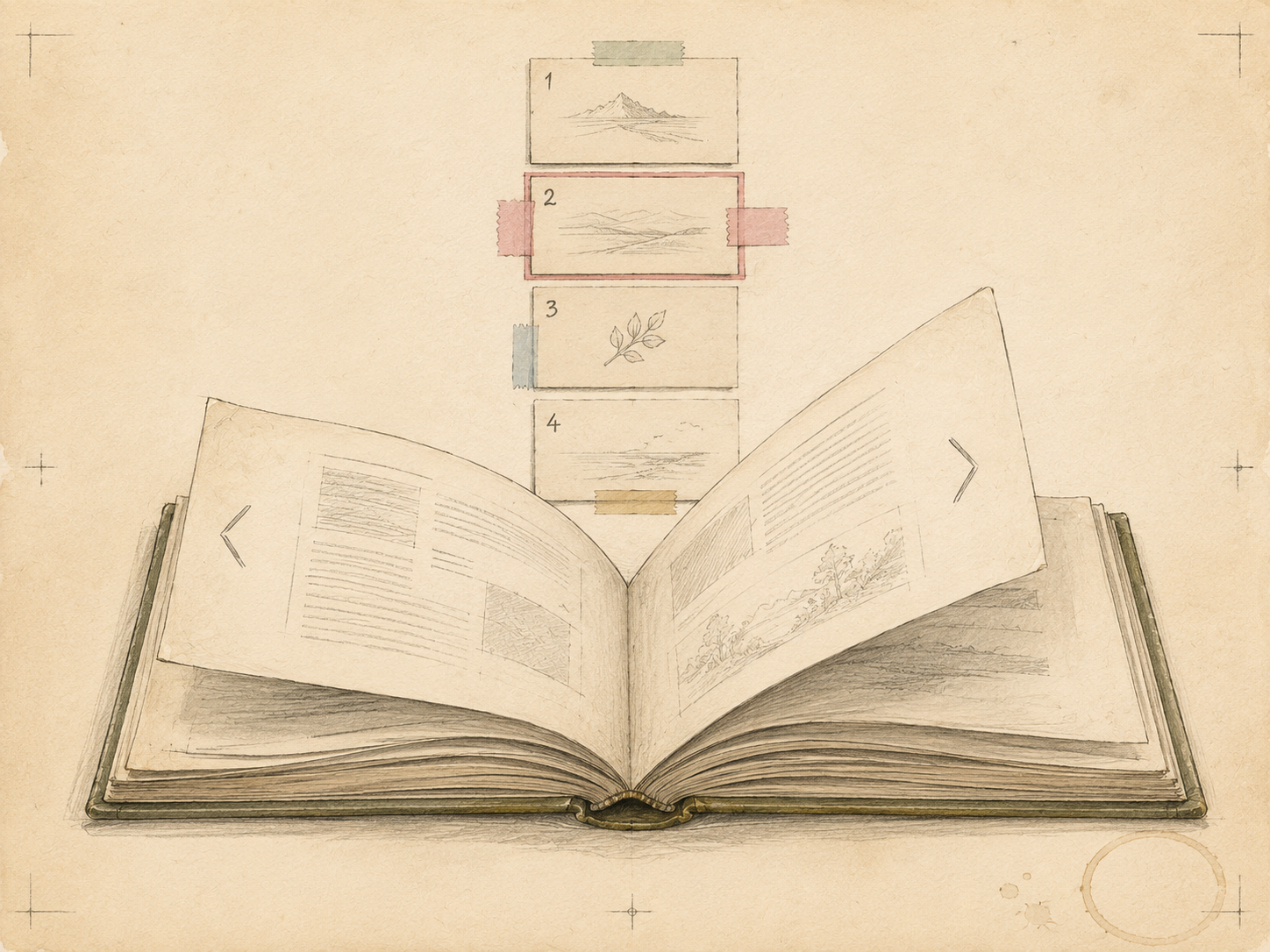
Inside each post in a series, a small panel floats to the right of the prose:
┌────────────────────────┐
│ AI RULES AND SKILLS    │
│                        │
│ 1. Rules as…           │
│ 2. AI agent…           │
│ 3. **A taxonomy…**     │
│ 4. Building…           │
└────────────────────────┘
The heading is the series name formatted from the slug. The post you’re reading shows up bold and unlinked — the “you are here” cue. On mobile (below 1024px) the float collapses into a normal block above the prose.
If there are fewer than two posts in the series, the component renders nothing — a series id can sit in frontmatter without producing noise until a sibling shows up.
The prev/next bar
A sticky bottom bar for navigating between posts chronologically. Prev on the left, next on the right, each with a label and the target title. Tap targets are at least 44px tall, and the body has enough bottom padding so the bar never covers the last paragraph or the Disqus thread.
Drafts are included in the chronology locally but hidden in production by the same CSS that hides them on listings. When the batch publishes, the nav reflects what readers can actually reach.
What this changes
Before, every post was an island. You finished reading, scrolled past Disqus, and the implicit answer to “what now?” was the back button.
Now, if the post is part of a sequence the side box tells you so — series name, post count, where you are, links to siblings. If you finish and want to keep going, the bottom bar is there. And on the search page, a new Series filter lets you click a series chip and see only posts in that arc, combined with category, tag, or text filters.
Small thing, took an evening. But the archive feels less like a flat list and more like a book you can navigate through.