Categories and better typography
One more day of development on this site, some more updates available. It’s nice to see the thing evolving!
Today I could improve considerably the typography, again… Yeah, because wasn’t good enough on previous version. Although I still think it always have room for more improvement, but need to focus on the schedule and deliver small changes at a time.
Checkout the list of updates:
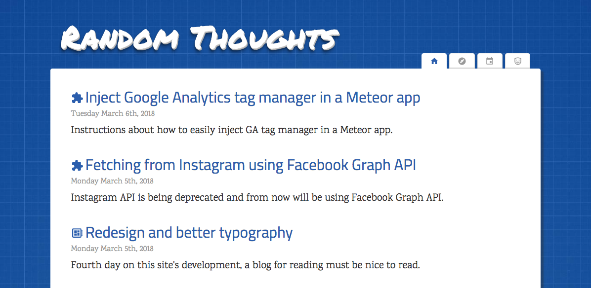
- Got rid of that sidebar in favor of the tabs navigation in the header;
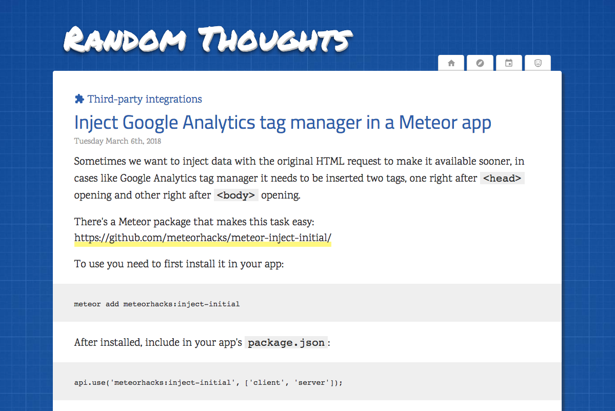
- The page have more space for text and have white background;
- New font families for headings and text;
- The post listing have icons for the categories;
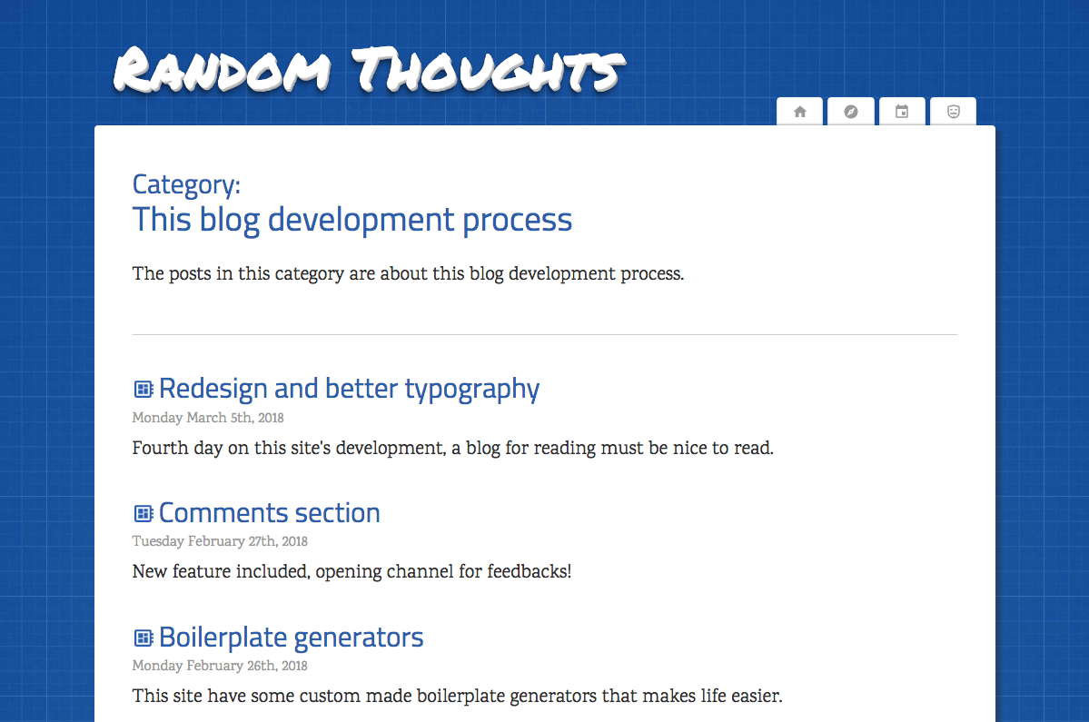
- The category page was assembled to list that category’s posts;
- Categories is now a content type, maybe will have a poster image in the future;
- Looks a bit better on mobile, although more work is still required to be fully mobile-friendly;
Categories
The idea of categories is to provide a way to have a collection of posts. A category is not exactly the same of a tag by some reasons:
- Categories are unique per posts and a post can have many tags;
- Categories have own pages while tags will only have a dynamic filter on search page;
At the time of this post, the content are available into 3 categories:
Typography
Well, the previous choices for typography wasn’t good, so I’m testing a new combination :)
- Permanent Marker for the site title
- Cairo for the headings
- IBM Plex Serif for the text
Screenshots
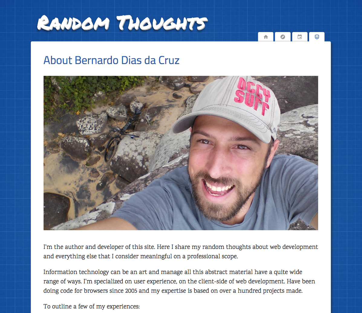
Some screenshots to keep a history of the changes.
Previous version
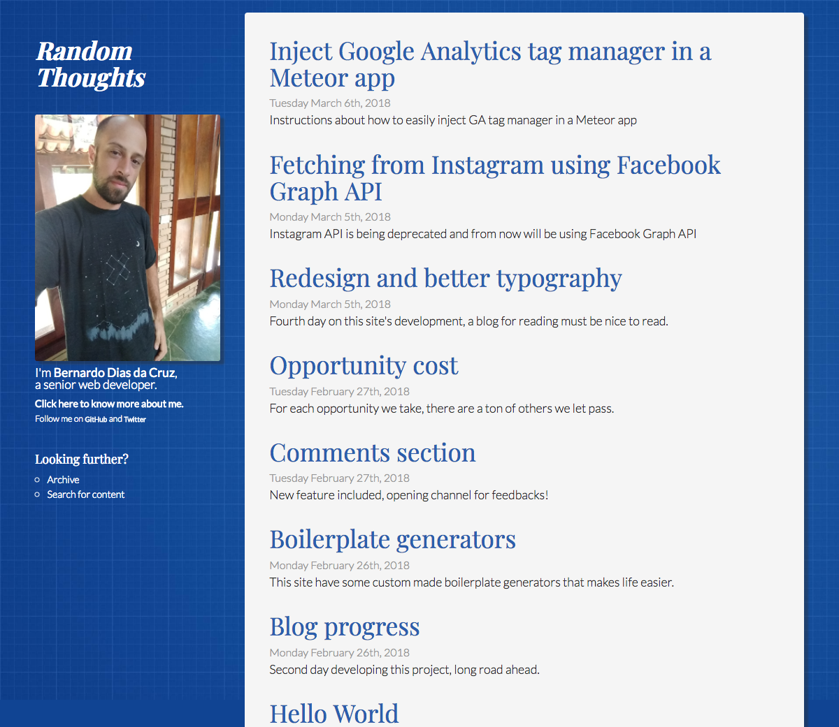
The current version
