Redesign and better typography
Creating new post:
$ yarn new:content
? What type of content would you like to generate? posts
? Content name: 2018-03-05-redesign-and-better-typography
Yeah, that’s how it looks my content generator. After that a Markdown file created with basic YML variables being used on posts.
Heading to the what this post is all about:
Design and typography progress
Disclaimer: I’m not a designer, what I do good is to make code out of graphic designs. Art direction is a whole different skill that requires huge experience and dedication. But step by step this project will look prettier, let’s see what we’ve got so far.
First round
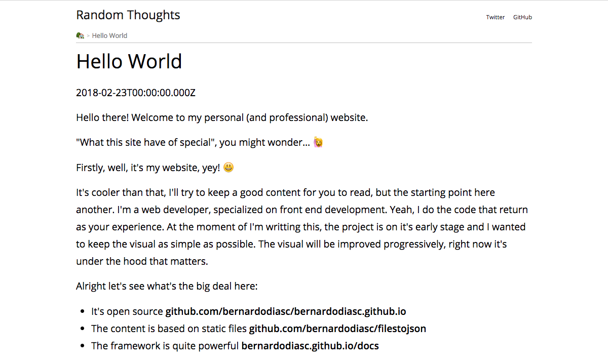
This version was most minimalistic as possible. I haven’t planned any design for this site so was more a matter to display content black&white that doesn’t looked like browser defaults and some minimal structure for layout the content and navigation.
Home page

Post page
Second round
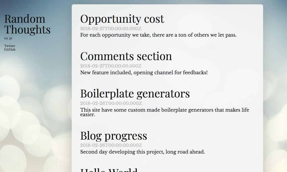
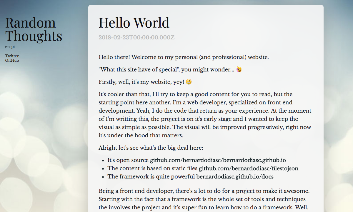
Few hours more, many CSS lines more. On this stage I’ve focused on creating some more CSS structures, more colours and an attempt of a design theme. The typography here still looks awful 😅
Home page
Post page
Third round
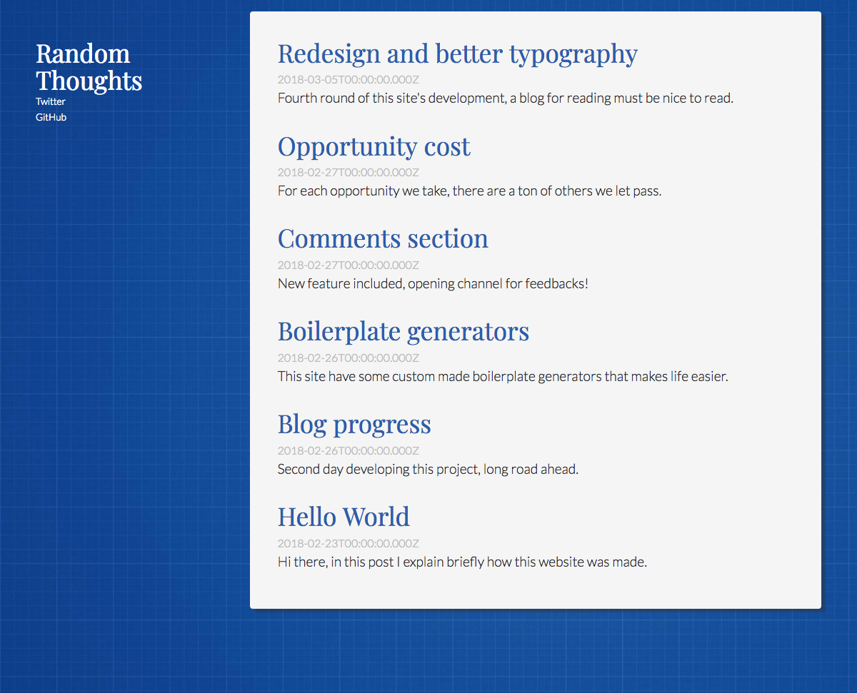
For the third round was very important to make the typography better. I started sharing my blog already and not everyone gets the fact that state of art takes a lot time, the time I haven’t yet spent on this project. But being a text content site by essence, make the reading experience good is crucial.
I choose 2 font families to work with, both provided by Google Fonts:
- Lato for common texts
- Playfair Display for headings
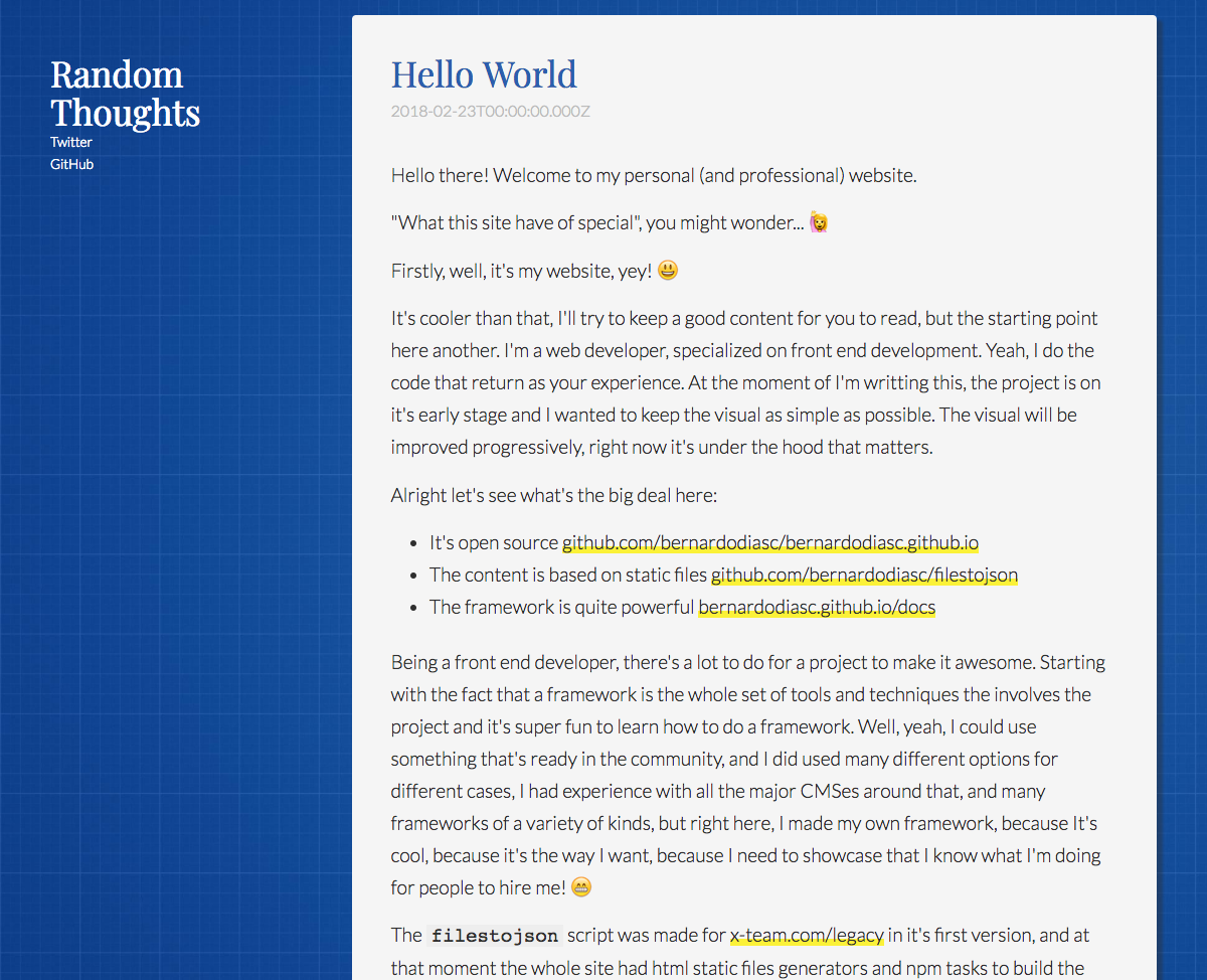
The blueprint theme relates to things I love to do, as in sketching UI, wireframing layout and information and front end architecture. Bootstraping projects is really fun for me. So I’m intended to explore a lot these subjects here in this blog, this theme kinda of made sense to me and I hope it sticks. 😄
On more technical details, I’ve created a lot CSS Variables to store constant values for typography, as colours and font-faces. During design updates I did a lot tries and updating directly on CSS variables, and that made this process much easier.
I also created the <TextBlock /> component (see example on docs) to hold all the typography styles within. I’ll dedicate one post just to explain why I isolate typography styles from global CSS scope, for now only a very basic typography styles are set on body and h1-6, and global resets on HTMl elements that are mostly set to inherit from parents.
Home page
Post page
I hope you like the progress so far, more visual upgrades will come soon. If you have suggestions, please let me know in the comments below!